
This is a part of our series called Shopify design breakdowns.
Heinz is a brand that has been around for a long time. They are one of the most trusted brands in America, and its products have been around for decades. This means that consumers would have high expectations from them even when they step into the world of eCommerce—the look and feel of their website should be as timeless as the products themselves.
Few brands have the cultural influence, customer loyalty, international distribution, and brand recognition of Heinz. So, it's only natural that we can learn a few things from them.
Heads up! This is a long post about Shopify Plus store design.
No, it's not just for Shopify experts. We'll demystify the design process and talk about how to make your own site look better with a few simple tricks. After seeing these sites, you'll have a bunch of ideas of your own to improve your site!
11 Shopify Plus design inspirations to take from Heinz and why it works
Inspiration is a powerful tool in the world of design.
The Heinz website design is, quite simply, brilliant. But why is it so brilliant? How did they do it?
Creating this kind of design and using inspiration like this is a powerful tool, and can be applied tactically when building your own Shopify Plus design.
Let's take a look at what works on the Heinz Shopify storefront.
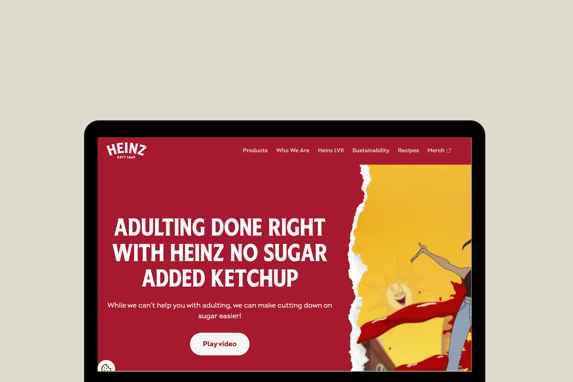
1. Video on the homepage
The homepage of Heinz's Shopify Plus design shows a video in the first fold that plays automatically when you load the page.
But it's not just any video—it's a funny and engaging explainer video that breaks down the meaning behind the company's new packaging. Here, they are using it to tell a story about how Heinz intends on ending the use of roman numbers.
The video is short and sweet, but it gives you all the information you need to know without having to read a long article or paragraph. This helps grab the user's attention as soon as they land on the Heinz website.
2. Bright and vivid colors
Heinz's website design is colorful, fresh, and fun. The typography is bold and strong, but not too cluttered.
This makes the entire website seem inviting.
This design is a great example of how you can use color to convey your brand's personality—in this case, Heinz's playful and energetic one.

3. Social media snippets on the homepage
Heinz has a social media snippets section on their homepage. This is great because it allows visitors to quickly see what Heinz is all about and what kind of conversations they can have with the brand.
It also makes Heinz look really cool, because it shows off all the different content they're sharing and lets users know that they're up to date with what's happening on the internet—and that they know how to use it! After all, as a brand, staying relevant is very important!
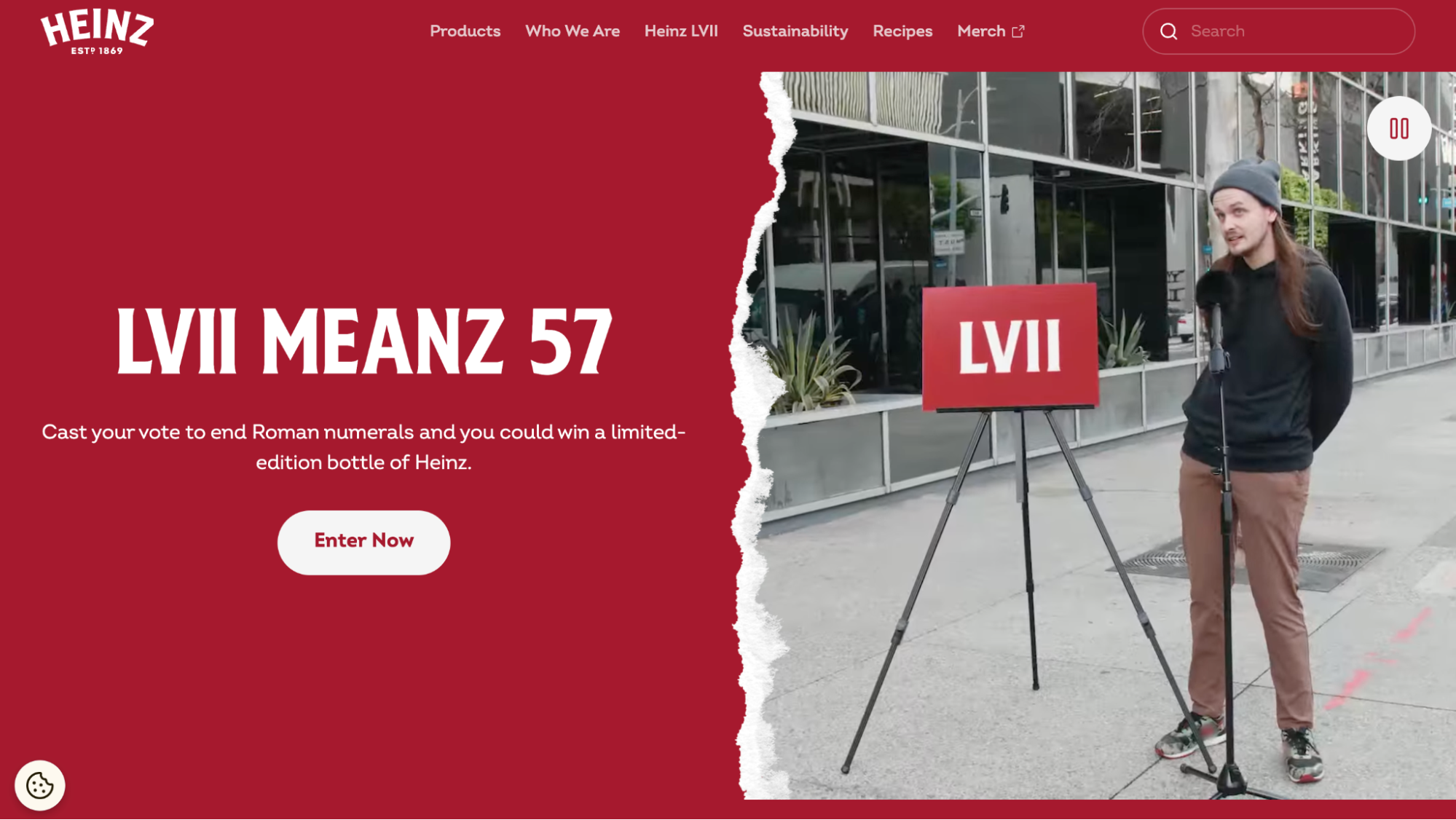
4. Sustainability vision
According to Forbes, 88% of consumers will be more loyal to a company that supports social or environmental issues.
Heinz proudly displays their sustainability vision throughout their website.
This is great because it gives customers an idea of what the company stands for and makes it clear that they care about the environment and community. They make it clear that they care about the environment and want to protect it for future generations.

5. Clean navigation bar with search functionality
The navigation bar on the Heinz Shopify Plus site is clean and simple, with search functionality at the top. The search bar is large and easy to read, with a clear font color and straightforward wording (i.e., "Search").

6. Vibrant CTAs throughout the website
Heinz uses Vibrant CTAs throughout the website, and they're all cleverly placed.
The home page features different CTA buttons, each with a different color scheme. The buttons are all well-designed, with large fonts and plenty of white space around them to make them stand out from the rest of the site. This is especially important because there are so many buttons on one page.
This is also true for the product pages, which feature CTAs for every single product on sale at Heinz. The colors used for these buttons match their respective products—for example, the green button goes with their green bean salad, while the purple button goes with their tomato ketchup.
Everywhere you look on this site, there's an eye-catching CTA to click!

7. Clear details of the products on the product page
The product page of the Heinz store is a clean and organized layout that provides a visual snapshot of the product. The main focus is on the product itself, with an image and description set up in such a way that it draws your eye to what matters most: the item you're looking to purchase. The rest of the content is kept in context with its purpose—to provide you with more information about what you're buying.
There's not much in the way of flashy graphics or other distractions. Instead, it's all about getting from point A (you seeing this product) to point B (you purchasing it).

8. Recipes page
When you're trying to sell a product, it's important to show people how to use it. On the Heinz Recipes page, the brand shows how easy it is for customers to use their products. This is a nice way to show off your products and give potential customers ideas for things they can do with them.

Here, they have a recipe for everything from a classic chili dog to an eggplant parmesan sandwich.
Heinz also uses this page as an opportunity to show off their brand's personality.
Furthermore, these recipes can also be filtered based on the viewers' real-world concerns like prep time, servings, and meal type.

9. About page
Heinz uses its about page to showcase the history of their brand and tell you about their values and mission statement. It also gives you an insight into what Heinz stands for as a company and how they operate today.
The rest of the page is split into three sections: one for their products, one for their history, and one for their vision. Each section is laid out clearly and concisely, with images accompanying each section to help break up the text and make it easy to read.
The design is clean and simple—just what you'd expect from an industrial food brand. But it's not boring; there are plenty of visual elements that draw your eye around the page, including a colorful background and bolded text.

10. Clean and informative footer
The Heinz footer is simple and to the point. It has an easy-to-read font, which helps users navigate the site quickly and easily.
The footer is simple, with a white background and black text. The main focus of the footer is to provide the user with links to important information. There are links to their privacy policy, terms of service, and contact page. These are all important resources for the user to be able to access if they need them.

11. Estimate shipping and tax on the checkout page

Did you know that extra cost due to shipping and taxes is the main reason why most eCommerce consumers abandon their carts? These are usually charges that the customer isn’t aware of and are suddenly presented at the time of payment.
In our opinion, Heinz has nailed their checkout experience.
The checkout page is clean and uncluttered, which helps to keep the customer focused on their purchases and makes it easier for them to complete their order.
As you can see in the screenshot above, they display both the estimated shipping and tax on the checkout page. In our opinion, this is a great way to make sure that your customers know exactly how much they have to pay before they finalize their order.

Wrapping up!
Want to set up a Shopify store as brilliantly designed as Heinz? We got your back!
Also read: Why Your Shopify Store Design Is Important to Increase Conversion Rates
XgenTech will help you bring your ideas to life with Shopify web design, development, marketing, and support services from experts.
Our team of Shopify experts works with Shopify merchants like you to design a store that reflects the personality of your brand and caters to the functionalities you require. Whether you want to revamp your existing design or build a new one from scratch, we will help you create a positive shopping experience on your Shopify store design.
Reach out to us at info@xgentech.net and we’ll help you set up your Shopify store design!
We're working with some leading Shopify and Shopify Plus brands to help them design a great online experience for their customers. Check out some of our work here.