
Learn how Vital Proteins uses different conversion and marketing strategies to drive higher sales with an interactive Shopify UI/UX.
An eCommerce website is more than just a place to sell products. It is a place to communicate your brand personality and engage your customers. Your storefront is what's seen by your customers, so it needs to be visually appealing and organized. There are a bunch of things you can do, but knowing what to prioritize is tricky.
Today, we took inspiration from Vital Proteins, a wellness super brand, to understand their Shopify store design better and share some of their design strategies that make their online store easier to experience.
Shopify Store Design Inspirations from Vital Proteins Online Store
1. A great attempt at growing the contact list
The contact list is an important part of every eCommerce website. They are a good way to grow your business.
If you’re selling products or services, it’s important to keep track of who has bought from you and who might be interested in buying in the future.
You should always make sure that you have a way for people to sign up for your newsletter or other contact lists on every page of your website. For this reason, it’s best if you create a form that pops up automatically when someone visits one of your pages (or even better – when they leave). This way visitors don’t need to remember anything else once they leave and will most likely fill out the form without any trouble at all!
Vital Proteins prompts users to provide their contact information the very instant they land on the website for the first time.
Notice how they’ve also added an incentive of a 15% discount to persuade the user to provide their contact details.
They can then use this information to carry out email, SMS, and/or WhatsApp marketing campaigns.

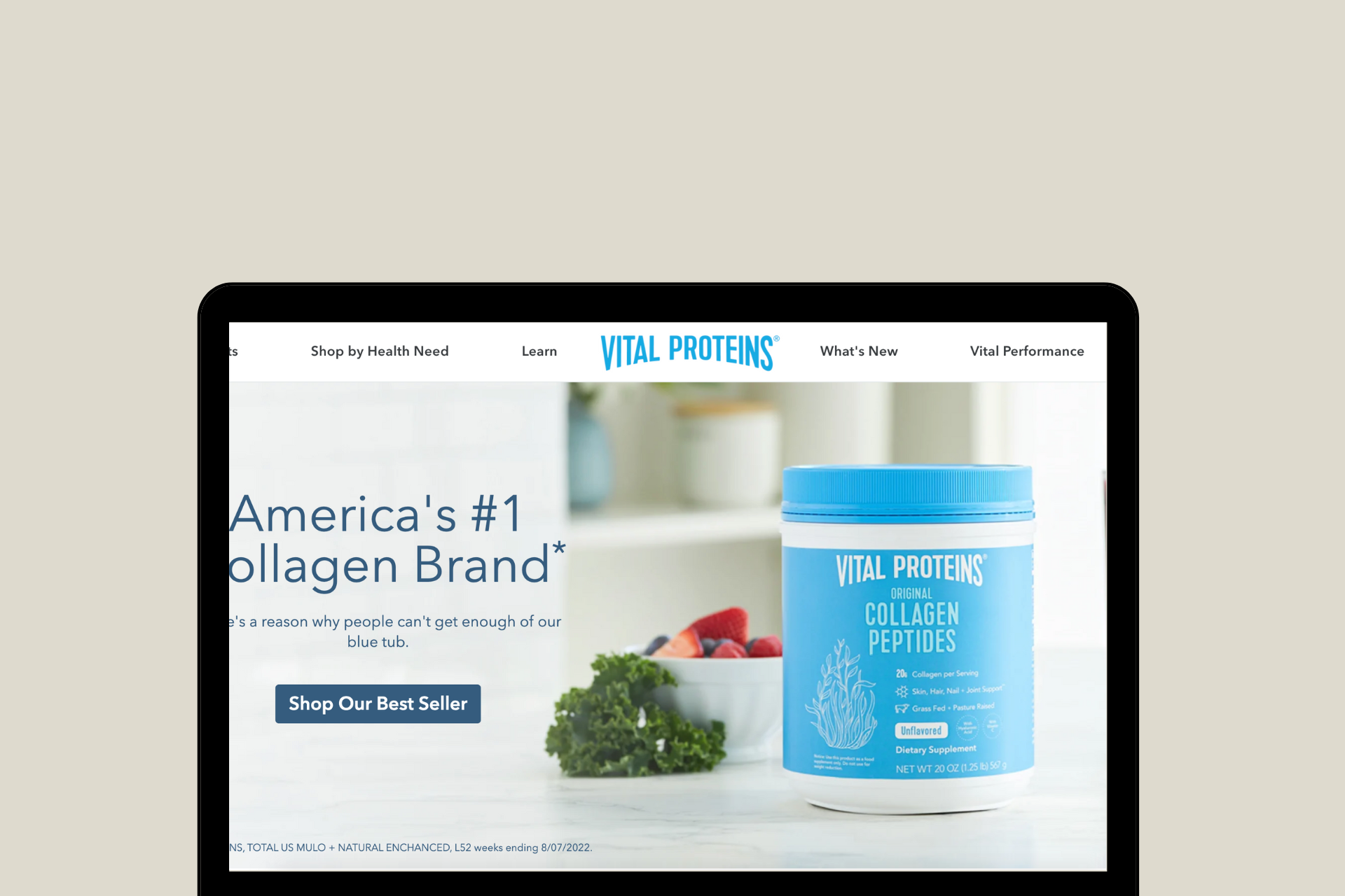
2. Visually-appealing hero image with a clear CTA
You want your visitors' attention as soon as they land on your homepage.
The best way to do this is by using a visually-appealing hero image.
This is great for engaging your customers and conveying the value of your products or services. They also increase conversions by acting as an anchor that pulls people through your website.
Vital Proteins realizes that a visually appealing hero image will help sell your product or service, but including a call to action in the form of an arrow, button, or another image that clearly indicates what you want visitors to do next is also equally important.

3. Include testimonials on the homepage to build trust from the get-go
Testimonials are one of the most powerful tools in the eCommerce marketer's arsenal. They can help you boost conversions and increase sales by proving to potential customers that other people like their products.
Showing real customer reviews on your site is a good way to show people that other people have bought from you before and they were satisfied with their purchase. This will make them more likely to buy from you as well.
Nevertheless, the Vital Proteins homepage is a great example of realizing how you don't need a ton of testimonials to make an impact, but you do need a few — as long as they're genuine and from real people.

4. A glimpse of their Instagram feed on the homepage
Social media is another great way to build trust as it can include a ton of user-generated content (UGC). This tiny design integration is also a great way to repurpose the content posted on Vital Protein's Instagram account.
Adding this social media widget on the homepage helps build trust and see value in the brand at hand if the brand has a good following and even better content!

5. Leveraging the fact that Jennifer Annsiton is part of the Vital Proteins fam
It is easier for most people to trust and find value in brands that are vouched by their favorite celebrities. Vital Proteins realizes and exercises this throughout their website by mentioning her top picks, pictures with the VP products, and so on!

6. Detailed mega navigation menu with an incentive
Users are always looking for a shortcut and quicker processes. Vital Proteins navigation menu is easy to use, with a clear structure and intuitive organization of categories.
Mega-navigation menus are a great way to organize and maintain your site’s navigation. They’re also great for search engine optimization because they help users find what they’re looking for.
They have also ensured that the menu is clearly visible on every page and that it's easy to navigate through it.

7. Clean, organized, and informative footer
The footer is often overlooked in eCommerce websites, but it’s a valuable place to add important information. You should include links to your social media channels, a customer service contact form, and return policy information.
You can also include a link to your privacy policy (which should be linked from every page of your site).
The footer is the last place you want a user to look, but it's also the most valuable real estate on your website. A good footer should be clean, organized, and informative.

8. Detailed information on the product page
The product page is a complex and challenging part of every eCommerce site. It needs to be carefully crafted in order to be successful.
The product page is your chance to shine and sell your products. If you have a great product, but don’t know how to sell it, then all your hard work was for nothing.
You want to make sure that your product pages are as detailed as possible. You don’t want to confuse your customers with too many options or too much information. But, if you don’t give them enough information, they won’t know what they’re buying!
Vital Proteins shows us that the key here is balance. Make sure you have enough information about the product without going overboard.

9. Promoting subscriptions on the product page
Vital Proteins product page is designed to promote recurring purchases. Contrary to the one-time purchase layout that lets an online shopper select the size/ quantity of the item, add it to cart and move to purchase, they have the subscription variable fields in the first fold.
They have also strategically swapped the typical ‘buy now’ button with the ‘subscribe and save’ call-to-action, letting buyers instantly understand the value behind the subscription purchase. The dropdown that lets one select the delivery frequency also helps buyers see the flexibility the brand has to offer.

10. Clear display of subscription plan value in the shopping cart
Subscription plans are always more profitable for most eCommerce stores since it ensures a steady flow of orders month-on-month, for instance.
If you want to get more customers and make more sales, then you should always focus on the value of your product.
When you add a one-time purchase product to your Vital Proteins shopping cart, you will be presented with all the right reasons why you should switch to a subscription plan instead. This is a great UI/UX addition that helps boost sales in the long run.

11. Express and distraction-free checkout
While checking out on Vital Proteins, you are given an option of ‘Express Checkout’ through ShopPay, Amazon Pay, PayPal, and Google Pay.
According to Baymard Institute, 18% of customers abandon their checkout before making a purchase due to too long or complicated checkout procedures.

Also, note how Vital Proteins ensures that its checkout page design stays distraction-free.
We also personally love the clear discount code field which is present yet not so prominently. So that the buyer doesn’t feel too negatively about not having a coupon code to avail during checkout, which usually otherwise leads to abandonment.
12. Clear indicators during checkout
Users like to know they have a sense of control over their experience. They like to know where exactly they are on the website, how to go back to the previous page (or next), etc. This is the core fundamental of any website’s UX.
The same goes for the user’s checkout experience as well. On the Vital Proteins website, you see a clear progress bar of the process.
13. Promoting product discovery with recommendations
Vital Proteins too knows how important it is to hook a buyer’s interest once they land on the website. To enable a shopping journey and also ensure the visitor discovers all the products available to them, they display product recommendations across all the product pages. They typically use different variables based on the category of the product to display these recommendations for higher context.

In addition to the same, we also like how they have included product ratings alongside the recommended products. This combines the power of contextual guidance of navigation and social proof to nudge the visitor to explore the next item on the website.

14. Making education a part of the shopping experience
Many times content is used as an added collateral by brands to drive organic traffic or tap into the power of SEO as they say. But Vital Proteins uses content more strategically by making it a conversion-element across the website. From displaying authoritative content on the home page that is aimed at educating the visitors to adding the same across all product pages, the brand is making sure they enable consumers to make informed purchase decisions - irrespective of the product they’re buying.

15. Use of product labels for visual nudges
Vital Proteins may not use flashy labels to promote their best selling products or new items in the store. But they do have clear product labels added to their products in their brand colors - the design and size of which are clear enough to help visitors visually demarcate the products; which further acts as a visual cue for consumers.

16. Using announcement bars to promote value propositions
Instead of using the announcement bar to only promote ongoing deals, Vital Proteins adds a rotational element to it. They use it to promote multiple value propositions - from deals on minimum orders to what’s new on the store or what they want to bring attention to, their announcement bars swap messages at every alternate second. This ensures all their value propositions and offers get noticed.


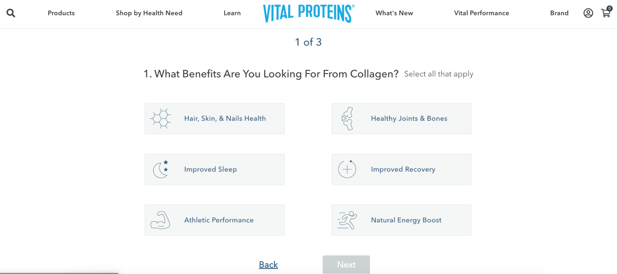
17. Gamifying shopping experiences with a custom quiz
Another conversion strategy and marketing hack that Vital Proteins makes use of is a quiz on the website. This helps the brand not just get to know the visitors and their needs better, but also show them how important it is for them to help them make informed purchase decisions; winning hearts for their genuine endeavor.

Furthermore, they have the quiz designed in a simple to interact with, 3-step process. The visuals used to depict selections makes it easier for the visitor to complete the quiz even with a fleeting attention span.
18. Syncing online and offline stores
Another smart strategy that Vital Proteins makes use of is a store locator on the website. This is to appeal to consumers who’d like to check out the products in-person before making the purchase. They have a smart form through which a consumer can select the products they’re looking for and then find a store accordingly.

List of Shopify apps used by Vital Proteins
- Searchanise - Vital Proteins understands the importance of simplifying how a visitor finds products on their website, especially owing to their vast catalog. With Searchanise, they have implemented a powerful search bar with features like typo tolerance, synonym search and more.
- Yotpo - The brand is using Yotpo to automate how they request product reviews from existing customers, and also customize how the social proof is displayed on their product pages.
- Pushowl - The health and wellness brand understands the importance of web push notifications to re-engage their store visitors. They have set up automations for welcome, cart recovery and often promotions around discounts through them.
- NoFraud for Shopify - To secure the transactions and orders placed on their online store, Vital Proteins uses this Shopify app for fraud detection and prevention.
- HulkApps - They use the app to display the GDPR cookie notice on their site; this helps maintain transparency about data and compliances with consumers.
Set up a Shopify store design like Vital Proteins
A poor eCommerce site interface translates to lost sales.
To build and design an impressive store like Vital Proteins, you need to work with Shopify design experts who understand what you are looking for and have industry knowledge of the changing trends and consumer preferences.
We help you bring your ideas to life with Shopify web design, development, marketing, and support services from experts. Our team of Shopify experts works with Shopify merchants like you to design a store that reflects the personality of your brand and caters to the functionalities you require. Whether you want to revamp your existing design or build a new one from scratch, we will help you create a positive shopping experience on your Shopify store design.
Reach out to us at info@xgentech.net and we’ll help you set up your Shopify store design!
For Shopify Plus theme development, you can contact us here.