If you’re planning to take your business online, you’re probably looking for some Shopify store design examples. You would want to understand the best tried-and-tested practices to help you put your brand story forward and showcase the best of your products with a great UI/UX too.
So in this article, we’re dissecting Bombas’ Shopify store design to inspire yours.
About Bombas
Founded in 2013, Bombas is an online store that sells socks, underwear, and t-shirts. They believe “a more comfortable world is a better world”.
Each item in their store is rigorously tested for comfort and durability. They’re also constantly looking for more ways to innovate and improve.
Their mission since to help those homeless people. They have an interesting concept in their store - Make A Purchase, Make A Difference. For every item sold, they donate an item.
They have donated more than 50 million items to more than 3,500 community organizations to date.
In 2021, Bombas reached a whopping $237 million revenue milestone.
Along with providing great products and services, they are also practicing some great UI/UX tips on their website that have enabled them to reach this height.
Shopify web design breakdown - UI and UX elements that get Bombas conversions
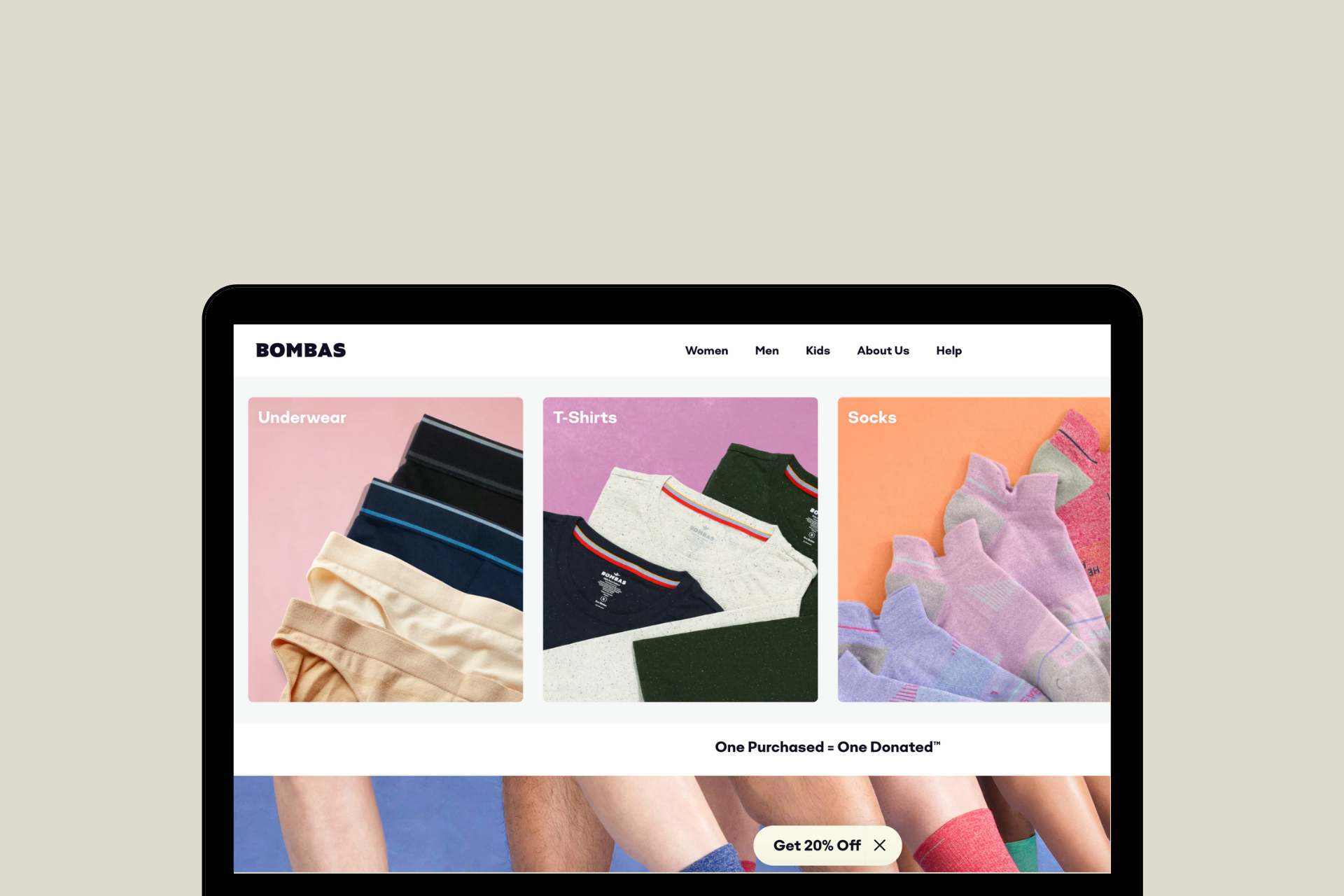
1. Quick links to collections in tiles right on the homepage
This makes it easy to see what is available on the site on the get-go. It helps save time and effort for your store visitors. And anything that does that, is a UX win!
It also encourages browsing to explore the other available categories.
Great design simplifies the structure of even basic tasks. And Bombas’ Shopify web design does just that. By making things simple and easily noticeable, it bridges the gap between ‘execution’ and ‘evaluation’, which is something most designers struggle with.

2. Full-width high-resolution images
This Shopify store offers better visualization of the products.
Visuals are always more appealing to us humans than just plain text. By using interestingly captured shots and clear CTA (Call to Action) on these high-resolution image banners, they are able to gather their store visitor’s attention and interest.
Additionally, even here, they’ve categorized the CTA as well. Thus, making discoverability and browsing so much easier.

3. Keeping scope for micro conversions
Not all your first-time store visitors are going to convert into customers right away.
Bombas understands this.
So for those visitors, who are not yet ready to buy their products, they have a micro-conversion integration. They engage and convert them into potential customers through a quiz. This lets them know the buyer better and make personalized recommendations.
They have also very smartly placed it midway on the home page which makes its discoverability a given when a user scrolls through.

4. Highlighting the cause on the homepage
Over 70% of consumers support brand cause marketing.
And so, Bombas mentions their brand’s mission on the homepage itself. This is smartly done with a clear design.

5. Clean and organized footer
In his book, The Design of Everyday Things, Donald A. Norman says, “When all else fails, standardize”.
That is exactly what Bombas has implemented in their website footer. Notice how this is a very basic footer design that does the needful. It’s clean, to the point, and well-organized.
However, instead of the traditional ‘About Us’ hyperlink, they use the ‘100% Happiness Guaranteed’ element - it has an instant social proof-like effect. So, it adds more credibility in a sense.

6. Detailed and clear product page design using overlays
While running an e-commerce store, you need to be able to provide as much product information as possible to your consumers on your website.
This is because, unlike traditional brick-and-mortar stores, here, the customer cannot see, touch, and feel the product before making the purchase. Your product page needs to be able to persuade them and guide them through their decision journey.
On the Bombas product pages, the images used show the product from all angles. The USPs like extra soft seams, etc. are shown clearly. The sizes and color variants available are displayed distinctly, and they use an interesting overlay to display them to keep the length of the page in check.

Furthermore, reviews can be filtered based on the requirements of the buyer. This is an interesting store addition that helps better the User Experience (UX).

7. Side slider cart
This seamless integration, allows the shopper to continue shopping even after adding a product to the cart without being redirected to another page. This means the user does not have to keep moving to and fro between pages. However, it still displays all the necessary information.

8. Clean checkout page design
According to Baymard Institute, 18% of customers abandon their checkout before making a purchase due to too long or complicated checkout procedures.
This checkout process is not just smooth but also distraction-free. The clear discount code field is also a great UI/UX addition.
Also, notice how the express checkout options - Amazon Pay and PayPal - are upfront.

9. Megamenu
An important aspect of great design is discoverability. Bombas uses clear and well-segmented menu items. This helps the user find exactly what they’re looking for with much more ease.
They have also added visuals here showcasing featured products. An excellent way to upsell and cross-sell.

10. Detailed about us
Instead of just one page, they have segmented things that the brand is about all. They’ve done this even on the menu.
This gives them more room to share their story. On this page, then talk about the ‘how’ aspect as well.
Unlike many e-commerce brands, they have used equal blocks of text and images to neatly present this information.

11. A dedicated page to ‘help’
Bombas has used a separate page for help-related information. This includes everything from policies to shipping to returns and exchanges and so much more. There is also a search functionality here which just enhances the UX of their Shopify store.


12. Size guide page
Did you know that sizing is one of the top reasons why online shoppers return their orders? Take a look at the responses received for reasons for returning an online order, in a study conducted by Narvar Corp.

Source - Narvar Corp
Bombas understands this consumer concern and addresses it in a very effective manner. They use clean tables describing size specifications for each type of product in their store.
It helps ease the buyer’s anxiety. This makes the online shopping journey on their site so much more user-friendly.

13. Collection page design
Bombas has dedicated collection pages. This makes finding what the user actually wants so much easier.
Additionally, filters on these pages help sift through products available in the most effective way.

The store also has a variant selector on this page. This means the user does not have to necessarily open a product page and then select the required variant.
Saving any extra click is a massive boost to the UX of that website. So this is a great interaction.

14. Sticky discount button
They offer an introductory discount code to all their first-time shoppers. This is displayed in the form of a sticky button.
This is a great integration since:
- It is difficult to not notice it and
- Once noticed, it can become a little difficult to resist the offer
So, this helps them entice their first-time store visitors and convert them.

Set up a Shopify store design like Bombas
Setting up a Shopify store design is no easy task. To build and design an impressive store like Bombas, you need to work with Shopify design experts who understand what you are looking for and have the industry knowledge of the changing trends and consumer preferences.
Also read: Why Your Shopify Store Design Is Important to Increase Conversion Rates
We help you bring your ideas to life with Shopify web design, development, marketing, and support services from experts. Our team of Shopify experts works with Shopify merchants like you to design the store that reflects the personality of your brand and caters to the functionalities you require.
Whether you want to revamp your existing design or build a new one from scratch, we will help you create a positive shopping experience on your Shopify store design.
Reach out to us at info@xgentech.net and we’ll help you set up your Shopify store design!
We're working with some leading Shopify and Shopify Plus brands to help them design a great online experience for their customers. Check out some of our work here.


