
This is a part of our series on Shopify Plus store design breakdowns.
Dressbarn, a popular women's clothing and accessories retailer, was faced with the challenging decision of closing all 650 of its physical stores recently. However, the brand quickly pivoted its business strategy and saved itself from extinction by transitioning entirely online.
In this blog post, we'll take a closer look at the Dressbarn Shopify storefront design and examine how it sets the brand apart from its competitors. We'll highlight key design features that other e-commerce store owners can take inspiration from and implement in their own stores.
10 Shopify Plus Store Design Best Practices Inspired by the Dressbarn Store
In the following sections, we’re going to look into some of the key aspects of the UI/UX strategy used by the Shopify Plus store to get more conversions.
1. Sticky Newsletter Form Button
The Dressbarn Shopify website incorporates a clever and user-friendly UI/UX element by implementing a sticky newsletter form. This feature is presented as a 25% off sticky button, which, when clicked, opens up a newsletter form.
This design choice is an excellent addition to the eCommerce store for several reasons -
- The sticky nature of the newsletter form ensures that it remains easily accessible to users throughout their browsing experience. This eliminates the need for users to search for the newsletter form, increasing the likelihood of capturing their attention and encouraging them to subscribe.
- By offering a compelling incentive such as a 25% off discount, Dressbarn effectively entices users to engage with the form and provide their email addresses. This fosters a sense of value for the users, enhancing their perception of the brand and increasing the chances of conversion.
- Opening the newsletter form within a popup or overlay helps maintain a seamless user experience. By not redirecting users to a separate page, Dressbarn eliminates any potential disruption to their browsing flow and keeps them engaged with the website.
2. Multiple cards as the hero element

The Dressbarn Shopify Plus website takes a unique approach to its hero element by featuring multiple cards instead of a single image. This design choice effectively captures the attention of website users and encourages them to explore various categories. By using only three cards, Dressbarn achieves a balanced and visually appealing layout that is easy on the eye.
The use of multiple cards as the hero element offers several benefits to the user experience. Firstly, it allows for the display of a diverse range of products or categories, giving users a glimpse of the variety Dressbarn offers. This piques their interest and encourages them to delve deeper into the website to explore the specific category that resonates with them.
Additionally, the limited number of cards prevents overwhelming the user with too much visual information. By presenting a concise selection of featured categories, Dressbarn ensures the hero section remains clear and uncluttered, making it easier for users to digest and navigate.
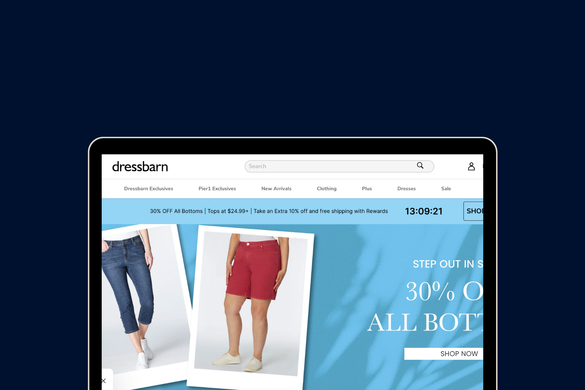
3. A contrasting announcement bar with a countdown timer

The contrasting announcement bar draws immediate attention to the ongoing sale and creates a sense of urgency among visitors. The use of colors that contrast with the overall website design ensures that the announcement stands out prominently, catching the user's eye and enticing them to take action.
The inclusion of a countdown timer adds an element of excitement and urgency to the sale. By visually displaying the remaining time, Dressbarn creates a sense of anticipation and motivates users to make a purchase before the sale ends. This creates a sense of importance and FOMO (Fear of Missing Out) that prompts users to take immediate action.
Moreover, the integration of a countdown timer in the announcement bar enhances the overall user experience by providing clear and easily digestible information. Visitors can quickly and intuitively understand the limited-time nature of the sale, necessitating timely decision-making.
4. A search bar that shows product results with images

The Dressbarn Shopify store features a user-friendly search bar that goes a step beyond traditional text-based search functionality. This innovative design choice includes images alongside product results, enhancing the user experience and making it easier for visitors to find the desired items.
Recommended read: How to optimize Shopify site search
5. Product catalog page with hoverable image change
The Dressbarn Shopify website features a well-executed design element on its product catalog pages by offering a hoverable image change. This design integration allows users to see the product from multiple angles or under different lighting conditions, enhancing their browsing experience and helping them make informed decisions.
6. Discount labels on product catalog pages

The Dressbarn website takes a strategic approach to online sales by displaying discount labels on its product catalog pages. This design choice draws the user's attention to products that are on sale and can help them make informed decisions when shopping.
By displaying discount labels, Dressbarn aptly captures visitors' eyes and directs their attention to products that are currently on sale. These labels usually include the new discounted price and the percentage of the discount, providing users with clear information and encouraging them to take advantage of the sale.
Moreover, discount labels help users make informed decisions. By highlighting discounted prices, users can compare products with similar features and specs and find the best deals quickly.
7. Rating summary on product catalog pages

The Dressbarn Shopify Plus website prioritizes transparency and customer satisfaction by providing a rating summary below products on their product catalog pages. This user-friendly design integration allows potential customers to quickly assess the quality and popularity of a product based on its ratings, leading to informed purchasing decisions.
This acts as a valuable social proof to visitors. Users can see the average rating of a particular product, often displayed as star ratings or numerical values, along with the number of customer reviews. This information helps users gauge the overall satisfaction of previous customers and build trust in the product.
The inclusion of a rating summary is a great design choice that enhances the user experience. It saves users time and effort by consolidating ratings in a concise format, making it easy to compare products and determine which ones have received positive feedback. This level of transparency empowers shoppers to make informed choices and instills confidence in their purchasing decisions.
8. Struck price display

The Dressbarn website effectively highlights discounted items by using struck price display on all product pages, as well as the product catalog page. This design integration grabs users' attention and visually communicates the discounted price in relation to the original price, helping shoppers make informed decisions and enticing them to take advantage of the sale.
This design feature is consistently applied on individual product pages as well as the product catalog page, ensuring a unified and cohesive shopping experience. Users can easily scan through various products and identify those currently on sale based on the struck price display.
9. A product recommendation section that lets you directly add all products to the cart

By including a product recommendation section, Dressbarn offers users additional options that may complement their chosen product or enhance their overall shopping experience. These recommendations are tailored to the user's browsing history, past purchases, or similar items frequently bought together, ensuring that the suggestions align with their preferences.
What sets Dressbarn's product recommendation section apart is the ability to directly add all recommended products to the cart. This feature simplifies the shopping process by eliminating the need for users to navigate to individual product pages and manually add each recommended item to their cart. Instead, users can conveniently select all desired products directly from the recommendation section, saving time and effort.
This design integration enhances the user experience by streamlining the shopping process and offering a seamless path to purchase. It encourages users to explore additional products, expands their shopping options, and increases the likelihood of multiple-item purchases, ultimately driving sales for Dressbarn.
10. Strategic membership plugin at checkout

The Dressbarn website maximizes customer loyalty and engagement by incorporating a strategic membership plugin at the checkout, just above the total cart amount. This design integration not only offers shoppers the opportunity to become members but also highlights the benefits and perks they can enjoy by joining the membership program.
By placing the membership plugin prominently at the checkout, Dressbarn ensures that customers are aware of this exclusive offer before they finalize their purchase. This placement serves as a gentle reminder that becoming a member can unlock additional advantages and savings, encouraging users to consider joining the program.
This strategic integration of the membership plugin at the checkout stage not only helps Dressbarn build a loyal customer base but also creates a sense of exclusivity and personalized shopping experience. By presenting the membership option alongside the total cart amount, Dressbarn effectively promotes the program's benefits and leverages the moment of purchase to encourage users to opt for membership, ultimately enhancing customer engagement and loyalty.
Set Up a Shopify Plus Store Design like Dressbarn
Setting up a high-converting Shopify Plus store design is a challenging task. To build and design an impressive store like Dressbarn, you need to work with Shopify design experts who understand what you are looking for and have industry knowledge of the changing trends and consumer preferences.
Also read: Why Your Shopify Store Design Is Important to Increase Conversion Rates
We help you bring your ideas to life with Shopify web design, development, marketing, and support services from experts.
Our team of Shopify experts works with Shopify merchants like you to design a store that reflects the personality of your brand and caters to the functionalities you require. Whether you want to revamp your existing design or build a new one from scratch, we will help you create a positive shopping experience on your Shopify store design.
Reach out to us at info@xgentech.net and we’ll help you set up your Shopify store design!
Additional reads for those seeking more Shopify store design inspiration: