
As Shopify designers, we’re often asked to share inspiration from good web design when brands reach out to us for setting up an online store. So we decided to share another such inspiration today from our list of favorite brands that we hope to work with sometime in the future and absolutely love the store design of - Allbirds.
About Allbirds
Allbirds was the first Direct-To-Consumer (DTC) brand to open an IPO. This brand stands as one of the biggest DTC success stories of the past decade, with an evaluation of over $1 billion (another reason why we look up to them for inspiration)!
Allbirds is a pioneer in the footwear industry that believes in simple designs, comfort over everything else, and the use of natural materials. The founders - Tim Brown and Joey Zwillinger - developed “an entirely new category of shoes inspired by natural materials, and an ongoing mantra to create better things in a better way.”
The Allbirds online store is a UI/UX genius work, with every element doing its best to better the customer’s shopping journey. It has obviously taken them years to perfect their store design and we’re going to break down the good elements for you to take inspiration from.
Shopify design breakdown - what we can learn from the Allbirds design
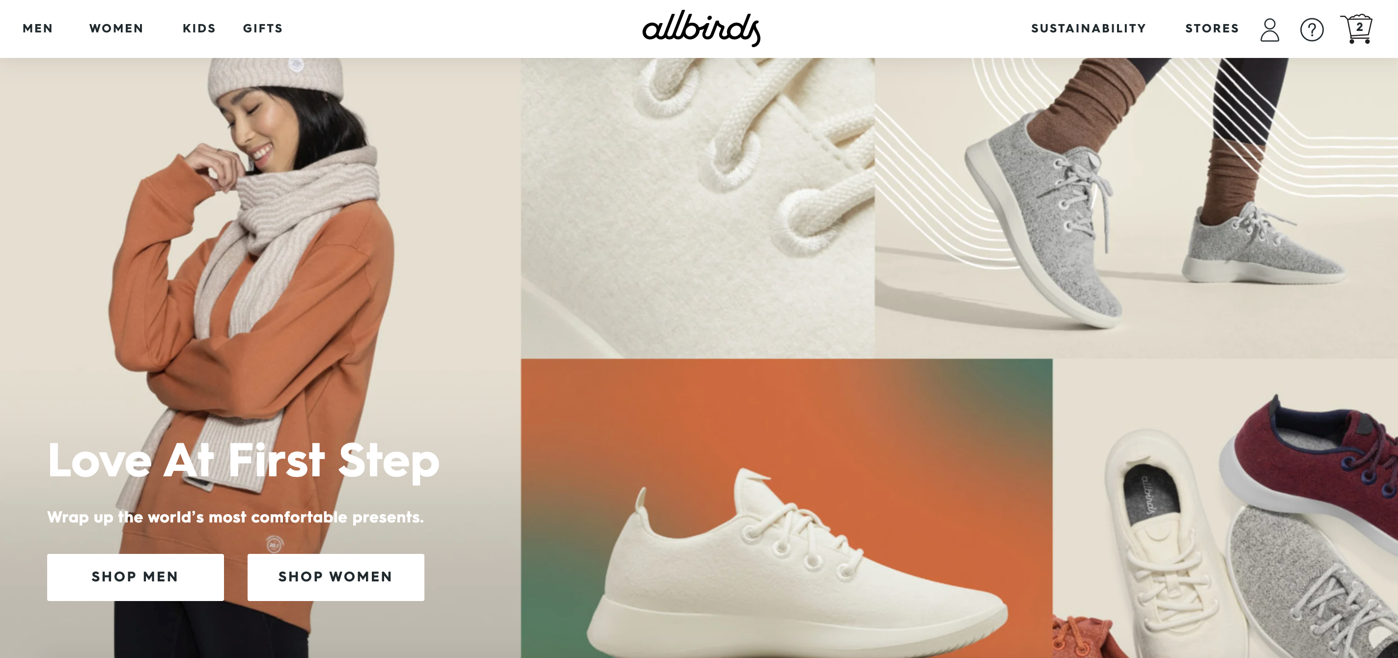
Big hero images that encapsulate what the brand is all about
When potential customers visit your site, you should be able to completely grab their attention from the very first instant. This is your moment to shine - the only problem here is you hardly have mere seconds to do so.
How does Allbirds manage to leverage these mere seconds, gauge customers’ attention, and also convert it to sales?
Well, humans respond better to visual content. Allbirds uses very high-quality images on their website as the hero element. This is an excellent way to grab your store visitor’s attention and also entice them to explore more on your website.
Allbirds has also very strategically managed to place their value proposition in the right places by the use of the entire first fold. What your store visitors see as soon as they arrive on your site without having to scroll as such is very important. This is why you need to plan the contents above the fold on your landing page very carefully.
Additionally, they also change the hero banner based on what they want to bring attention to in a similar way.
Clear hero call to action to guide a buyer journey
Yes, Allbirds managed to encapsulate what their brand is all about in the hero images and also increased the customer’s interest in their store. But, what after that?
They have very cleverly added a clear Call to Action (CTA) above the fold of their landing page. In the above screenshot, notice how they link to Shop Men and Shop Women buttons. For first-time visitors, this helps nudge them in a very decisive and clear direction.
Highlighting collections on the home page with high-quality images
Instead of just using small images in thumbnail forms, they opt for bigger images to highlight their collections in their Shopify store design. Furthermore, under each of these images, they also add a little line that highlights the USP, making the visitor want to explore the same. This acts as a great persuader.
Since most of us are driven by visuals, this is a great way to get a visitor to explore the product catalog.

Product in focus, full-width images
To highlight the collection of products they want to bring the most focus to, they use massive pictures to attract the visitor’s attention. Since the image is distraction-free and not shown as a product in use, the main item is in the complete spotlight.
And we all know how important that is to sell an item from a category that is heavy on competition as of today!

Full-width video to show their story/ BTS
Videos are undoubtedly more engaging and convey a story better.
Allbirds have managed to make the most of this too.
What is interesting to note here is that, while their design has used a video, they have also tactically placed it a little lower on the landing page so that there are no load time issues as well. Genius!

A strategic micro-conversion
Not all visitors will make a purchase. And Allbirds understands this.
So, instead of just losing a prospective customer forever, they nudge them to subscribe to their newsletter. And unlike most others, they have actually made this a part of their design, by adding it right before the end. This makes it feel more natural as you browse the site as compared to pop-ups asking for the same thing.

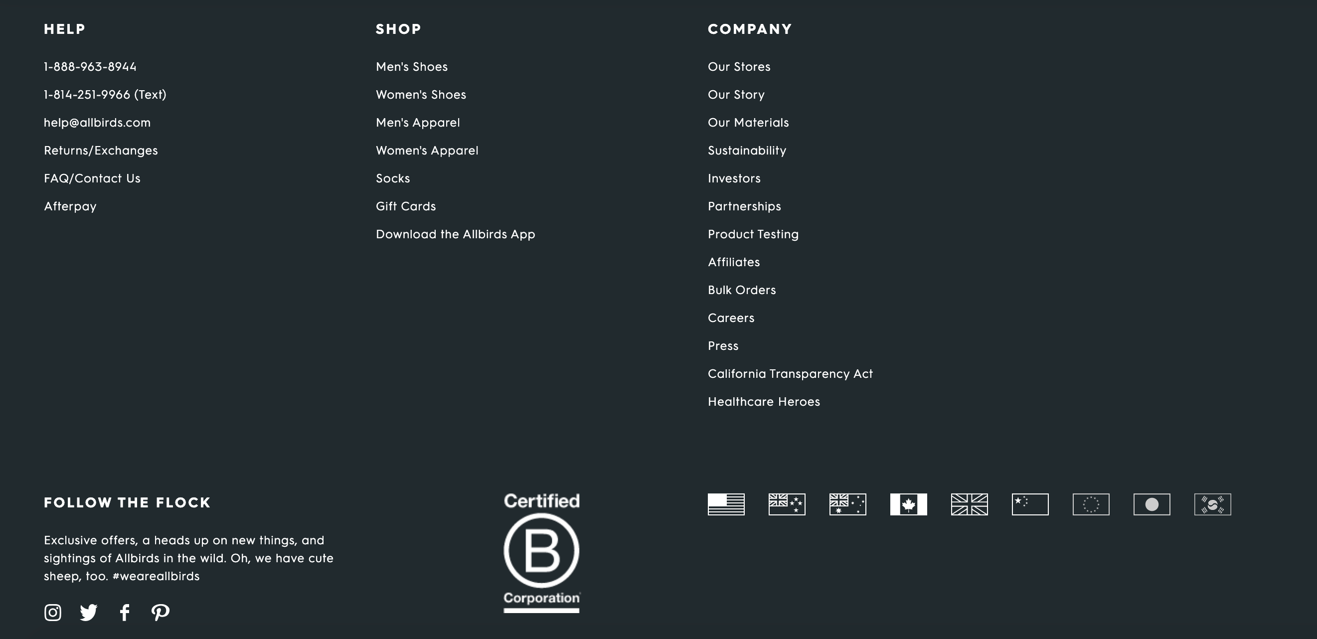
Clean and informative footer
Allbirds has integrated a clear and crisp footer in their Shopify website design.
Notice how the links and information are categorized and spaced out here. Most online stores don’t look into the footer design as much but as a startup that opened an IPO, they needed to link to information like investors, for instance, without taking away the attention from the products as well. It’s a win-win!
High-resolution gallery of images on product page
Allbirds show the product in-focus images and product in use images both.
They also have videos for products in the gallery. Additionally, each image can be clicked to zoom in to take a closer look.
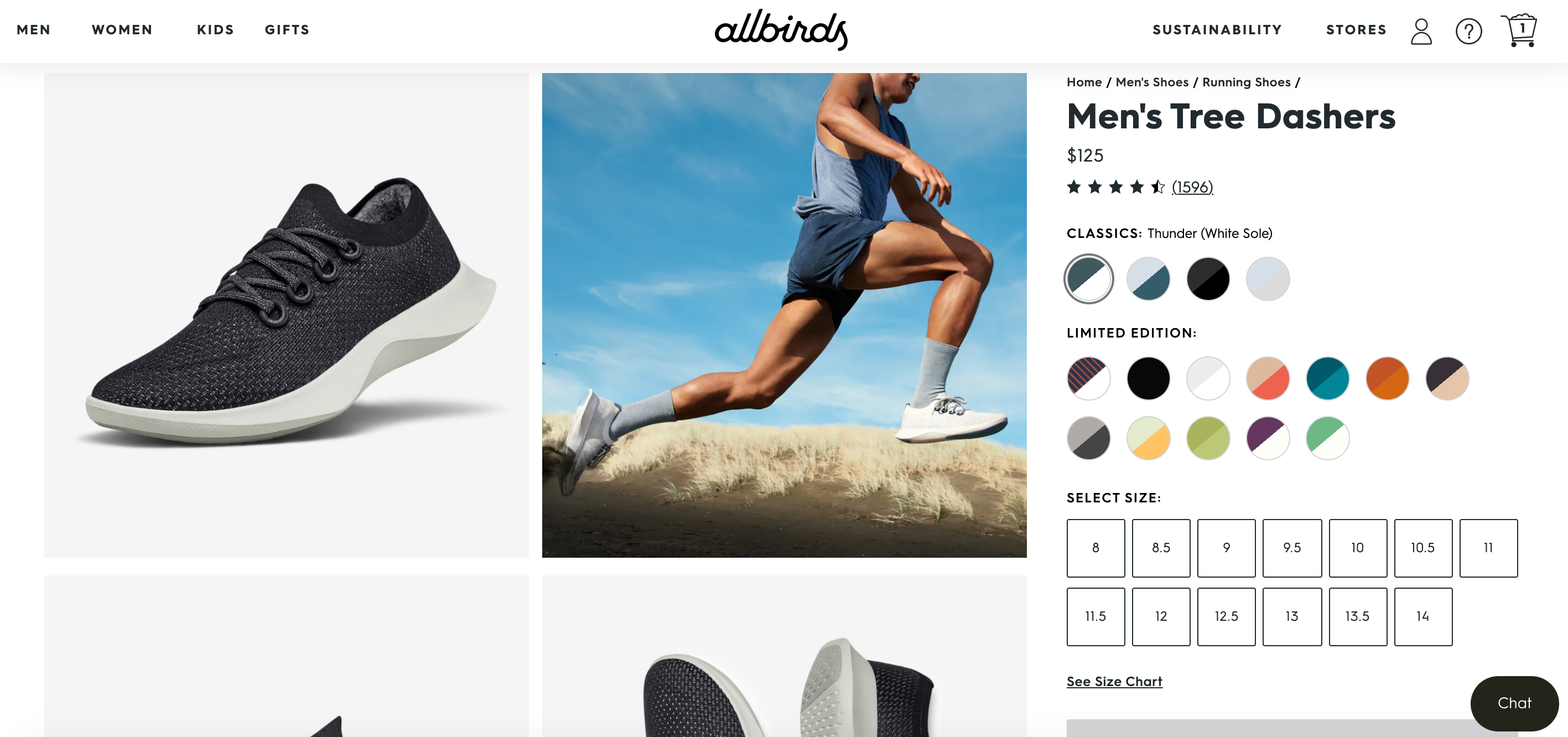
Ease of browse features on the product page
In the above screenshot, notice how there is a size and variant selected right under the product title. Additionally, Allbirds also displays product ratings high up on the product page. This is so that social proof hooks the buyer’s attention early on and persuades them to make the purchase.
Well described products
Product descriptions are important. Especially while shopping online. However, most store owners think lengthy product descriptions may clutter the product page.
Allbirds use a collapsible element to display as much information as possible. So, while the store design still remains clean and neat, they also don’t have to compromise on the necessary product detail display.
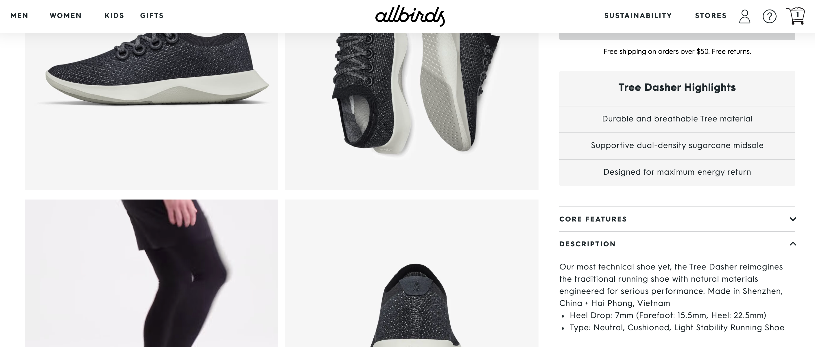
Highlighted product USPs with high-quality images
On their product pages, just below the main information, Allbirds have the other USPS lined up in this way.
The visual + text combination, spaced out well, helps people see why they should buy the product they’re exploring.

Product recommendations on all pages
A simple section of recommended products displayed on all product pages helps visitors explore more items similar to what they are interested in. This helps the brand reduce its bounce rate and get more items discovered.
This is a great UI/UX practice to upsell and cross-sell.

Summary of reviews
While social proof is a needed element in your Shopify store today, Allbirds takes this a level higher in their store design. Visitors don’t need to browse through all reviews to get a better understanding of the products.
This is an excellent way to help your customers get rid of any skepticism about sizes, for instance, when it comes to buying footwear online.

Enhanced search functionality
The easier it is for someone to find what they are looking for on your Shopify store, the more likely they are to convert.
Since Allbirds has a wide range of products, they have integrated an advanced search functionality on their website.

A dedicated page to sustainability - their vision and mission
71% of consumers support and prefer buying from companies aligned with their values and visions. Of these, 83% of Millennials say it’s important for the companies they buy from to align with their beliefs and values.
Your brand needs to put your core beliefs, vision, and mission out there. This helps you attract the right target audience to your ecommerce store.
Allbirds manage to do this effectively. They have a dedicated page for sustainability - something that they truly believe in. On this page, each of the sub-points links to detailed pages. This lets the store visitors see what the brand is all about and what it associates itself with.

Mega Menu for easy navigation
Notice how Allbirds have streamlined the number of items they display and the way they are categorized in the menu. With the use of negative spacing to keep each menu item well-segmented and the featured collections being highlighted with images, this menu is a UI and UX masterstroke!

Slide-out cart page
Every time you add an item to your cart on the Allbirds website, a small window slides out from one corner displaying all items in your cart. That is, you are not taken to another page altogether.
This is a great User Experience (UX) addition because this does not interrupt and break the shopper’s browsing experience. So, the chances of the shopper to browse through other products as well is more likely instead of feeling like they’re done.

Clutter-free checkout page
The simpler the checkout process, the better. If you keep this leg of the shopping journey lengthy, chances are users will most likely abandon their cart.
Allbirds’ mobile-optimized checkout page asks only for information that’s important, thus keeping it short and to the point. The express checkout option is a very interesting UX integration. Did you know that around 23% of online shoppers will abandon their shopping cart if they have to create a new user account to proceed?
Additionally, the UI is clear and visually appealing with adequate use of white space and a neat display of the product details.

Information about stores
Since Allbirds also has multiple physical stores, they promote their offline shopping experience on their online store as well.
They provide their online store visitors with information about their store locations and timings. They have also used custom illustrations to describe each of the cities they function in. This is a fun and quirky twist to an otherwise pretty basic list.

Also read: Shopify Store Design Breakdown: Dissecting Kylie Cosmetics and their Store Design
Please note: The Allbirds Shopify theme continually keeps evolving on the basis of how their store visitors and customers respond to the shopping interface provided to them. Each of the changes are possible using Shopify theme customizations that can be made with the help of experts.
Conclusion
Want to set up a Shopify store as brilliantly designed as Allbirds? We got your back!
XgenTech will help you bring your ideas to life with Shopify web design, development, marketing, and support services from experts.
Our team of Shopify experts works with Shopify merchants like you to design the store that reflects the personality of your brand and caters to the functionalities you require. Whether you want to revamp your existing design or build a new one from scratch, we will help you create a positive shopping experience on your Shopify store design.
Recommended reads on Allbirds:
- How Allbirds has implemented an omnichannel marketing strategy on Shopify to provide 'buy in store and ship to customer' model using the Shopify POS
- How Allbirds is moving to headless commerce with Shopify's Hydrogen and Oxygen - to get started with headless commerce, you can reach out to our Shopify experts
Reach out to us at info@xgentech.net and we’ll help you set up your Shopify store design!
We're working with some leading Shopify and Shopify Plus brands to help them design a great online experience for their customers. Check out some of our work here.