

Started by a 19-year-old, Ben Francis, back in 2012, Gymshark is a fitness apparel startup. Today, Gymshark is one of the fastest growing global fitness and apparel brands globally.
In just a matter of 7 years, Gymshark has achieved great success with building an empire that’s valued between £300M and £400M!

Source - Statista
They have very strategically designed their store in such a way that it makes shopping easy - and yet, is very on-brand. We took inspiration from Gymsharks to understand their Shopify store design better and share some of their design strategies that make their online store easier to experience.
Also read: Shopify Store Design Breakdown: Dissecting Kylie Cosmetics and their Store Design
Shopify Store Design Inspirations from Gymshark’s store
Gymshark has spent years perfecting their Shopify store design to not just deliver a great experience to its shoppers, but also drive more conversions. We’re going to cover some of the design aspects that make their website shopping-friendly.
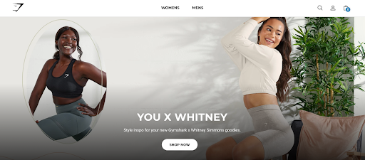
1. Feature the latest collection with full width banners and animations
As an e-commerce store, you want your value proposition to always take centre-stage. This can be done with wide banners and animations.
To do so, keeping the copy crisp and short and the visuals as eye-catching as possible is vital. Remember, you only have mere 50 milliseconds to make a good first impression and persuade your customer to make a purchase from your store.
Gymshark understands this and executes it extremely well. With an added distinctive CTA (Call to Action) button, this is just perfect!

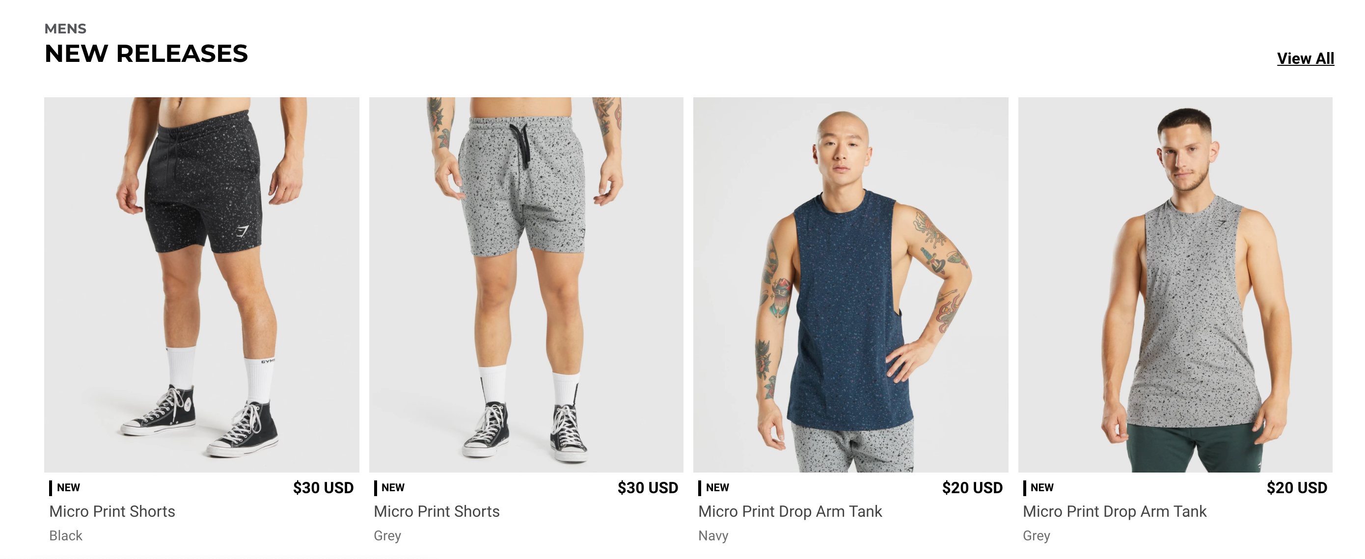
2. Showcasing new releases for both men and women on the home page
Gymshark has a very ‘to-the-point’ homepage making the entire User Experience (UX) an absolute delight!
By simply directing the users towards a clearly distinctive New Releases section you help make their shopping journeys smoother and faster. Gymshark even takes it a step further and further divides the new releases session based on gender - thus, further enhancing the user experience.

3. Showcasing prominent collaborations with full-width images
According to surveys, about 57% of online purchases are influenced by celebrity trends and influencer choices. Gymshark knows this well and makes sure they highlight any such collaborations in the best way possible - clearly and prominently! !
They use full-width images here as well to ensure that the faces that hold the power to influence consumer decisions remain up, front and center to drive a visitor towards taking a desired action on the store.
What’s more?
They also tailor the design of their recommendation widget to make it look like the influencer’s own lookbook or wishlist.

4. Mega menu with new releases and must-haves
Gymshark has a mega menu that helps customers navigate easily. Their menu not only has not just categories, but also collections and activity. It also showcases their featured collections along with their product recommendations (Must Haves).

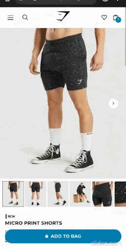
5. Quick add feature with variant selector
Any UI/UX practice that makes the buying journey of the user a breeze is an instant win. Take Gymshark’s quick Add to Bag feature with a variant selector - users now don’t have to (necessarily) make an additional click to the product page to place their orders.
This is especially a handy design and conversion feature considering the fleeting attention of online shoppers.

6. Clean product pages with images and videos for more engagement
It goes unsaid that customers will place an order only after carefully viewing the product.
Gymshark adds both pictures and videos (when needed) that are vivid, high quality, and zoomable from all necessary perspectives.
An additional element you will see on product pages of those items that come with variants, are small thumbnail images of those as well. This makes it easier for the visitor to also visualise how the product may look in other variants before actually exploring them.

Also read: eCommerce Trends To Optimize Your Product Pages For More Sales
7. Product recommendations on every product page to keep people browsing
Gymshark misses no opportunity to upsell and cross-sell. A simple product recommendation division on your product pages is your best chance to increase a user’s total cart value.
This particular conversion element basically leverages the intent and interests a visitor has displayed, to show them products they are likely to be interested in further. For example, if they’re looking for lowers, GymShark uses this space to introduce them to shorts and upper wear to complete the entire look.

But what we also like about this conversion feature is its design. GymShark has ensured that it follows the same theme style as the rest of the website, keeping the products up, front and in-focus. It also includes the price and a summary of the product details to make it easy for buyers to decide which item they’d like to further explore.
8. Has a customer account page
Gymshark lets users wishlist items, keep track of their orders - it’s like a shopper’s own little space. All this information is stored in the user’s own Gymshark account, that they can come back to every time they need to make a purchase.
In addition to order tracking, their customer account page also lets visitors create wish lists of items they want to purchase, request support, exchange or returns on the items they have ordered.
It’s pretty much similar to how Amazon offers a customer account page to its customers.
9. Restock subscription ability
You obviously do not want to miss out on any possible opportunity of making a sale. Stockouts are a major problem to achieve this. How do you deal with this then?
By promptly sending out notifications about any restock update, Gymshark not only enhances their store’s User Experience, but is also increasing their sales rate by 20%.
Back-in-stock notifications are usually sent via emails but brands are gradually moving towards SMS, WhatsApp and Facebook Messenger as well.

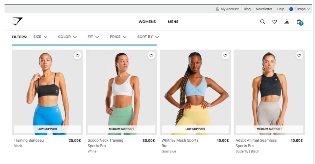
10. Adequate informational labels
Gymshark uses an interesting set of product labels giving the user the necessary information required. This saves the user the effort and time of having to click on every product to find what they were actually looking for.
This is a UX master stroke!
11. Sticky add to bag button in mobile view
45% of US ecommerce sales are done through mobile phones. As an ecommerce store, you cannot not prioritize responsive mobile designs. If that’s not convincing enough, hear this - 62% of users are less likely to purchase from an online store if they have a negative experience on a mobile website.
Gymshark takes these numbers seriously. And it is evident throughout their site design. One such responsive design element is the use of a sticky Add to Bag button. According to a study conducted by Growth Rock, sticky Add to Bag Button increases order rates by 8%.
12. Express and distraction-free checkout
While checking out on Gymshark, you are given an option of ‘Express Checkout’ through PayPal.
According to Baymard Institute, 18% of customers abandon their checkout before making a purchase due to too long or complicated checkout procedures.
Also note how GymShark ensures that their checkout page design remains distraction-free. They retain the important information and restrict all the other branded elements to include only the logo and their tagline.
We also personally love the clear discount code field which is present yet not so prominently. So that the buyer doesn’t feel too negatively about not having a coupon code to avail during checkout, which usually otherwise leads to abandonment.

Also read: Shopify Scripts and How It Can Help You Optimize Shopify Plus Checkout for More Conversions
13. Clear indicators during checkout
Users like to know they have a sense of control over their experience. They like to know where exactly they are on the website, how to go back to the previous page (or next), etc. This is the core fundamental of any website’s UX.
The same goes for the user’s checkout experience as well. On the Gymshark website, you see a clear numbered progress bar of the process. And remember, numbered lists are almost always better than unordered lists. It gives the user so much more clarity and enhances their overall experience.

AI and smart design: How Gymshark-style stores have gotten smarter
From strategic banner positioning to intuitive navigation, Gymshark has thoughtfully designed its website experience. Stores like Gymshark, can integrate AI capabilities to further enhance these features. Here are some ways AI integration can enhance eCommerce experience:
1. Predictive UI personalization
Gymshark’s homepage has a ‘New releases’ section that displays new products. Imagine if this section was dynamic and displayed personalized products based on which customer was browsing? It’s possible with AI.
AI-based personalization tools can gather insights from customer data, such as location, browsing history, past purchases, etc., and dynamically display homepage banners and featured products.
By implementing predictive UI personalization, you can make every customer feel like the online store was specifically designed for them. This increases engagement and conversion rates.
2. Automated visual content optimization
Gymshark has impressive images all across its website pages. However, for any brand, managing images and ensuring consistency across all pages can become a difficult task. That’s where AI-powered visual optimization tools come in.
The AI tools can automatically generate, reformat, resize, crop, and adjust lighting and contrast of images for different pages, platforms, and user contexts. AI tools can also conduct A/B tests for images, product photography angles, and image treatments.
The AI systems learn which visual styles resonate with different audience segments and automatically focus on the high-performing visual variants. This means AI can handle all the technical optimization, while your creative team focuses on strategy.
3. Smart product recommendations and cross-selling
Gymshark shares many product recommendations on its website. But a one-size-fits-all approach does not provide desired results in recommendations. AI-powered recommendations and cross-selling lead to higher returns.
AI-powered product recommendations learn from user behavior, understand preferences, and shopping patterns. This way, AI shows products that are contextually relevant.
For instance, if a customer is looking for gumboots for the monsoon, AI can create a ‘Complete the look’ recommendation section that includes a raincoat, umbrella, and other monsoon accessories. Over time, the AI engine becomes smarter as it keeps gathering and analyzing data.
4. Design-aware A/B testing orchestration
Traditional A/B testing methods require time and manual effort. AI can automate testing orchestration. AI systems can simultaneously test multiple variations of banners, CTAs, section ordering, color schemes, content, etc.
AI can learn which sequences and design patterns drive better conversions. Moreover, instead of testing one element, AI can run multiple tests at the same time. AI A/B testing insights collected over time keep enhancing results.
5. Automated UX monitoring and error detection
Ecommerce stores can develop issues over time. For instance, layout breakages, visual inconsistencies on devices, broken links, etc. AI-powered monitoring systems can continuously run quality assurance tests and detect issues. When problems are detected proactively, your technical teams get enough time to fix problems before it starts impacting conversions and sales.
6. Dynamic micro-animations and effects
Static banners and images have limited engagement potential. AI can create micro-animations and motion effects, for example, hover states, scroll reveals, entrance animations, etc.
These animations can be tied to user behavior and contextual triggers. AI systems learn which animations enhance customer experience, create dynamic adjustments and increase engagement.
7. Personalization of labels, badges, and messaging
Gymshark displays many informational labels on its website. AI can make these labels more powerful. For instance, AI can share labels backed on real-time stock levels, time of day, individual user patterns, and browsing velocity.
For example, a product that is low in stock can have the badge ‘Only a few left’ or ‘Low stock’, when AI notices a customer visiting the page multiple times. This can create urgency and encourage the customer to make a purchase.
Set up a Shopify store design like Gymshark
Setting up a Shopify store design is no easy task. To build and design an impressive store like Gymshark, you need to work with Shopify design experts who understand what you are looking for and have the industry knowledge of the changing trends and consumer preferences.
Also read : Why Your Shopify Store Design Is Important to Increase Conversion Rates
We help you bring your ideas to life with Shopify web design, development, marketing and support services from experts. Our team of Shopify experts works with Shopify merchants like you to design the store that reflects the personality of your brand and caters to the functionalities you require. Whether you want to revamp your existing design or build a new one from scratch, we will help you create a positive shopping experience on your Shopify store design.
Reach out to us on info@xgentech.net and we’ll help you set up your Shopify store design!
We're working with some leading Shopify and Shopify Plus brands to help them design a great online experience for their customers. Check out some of our work here.