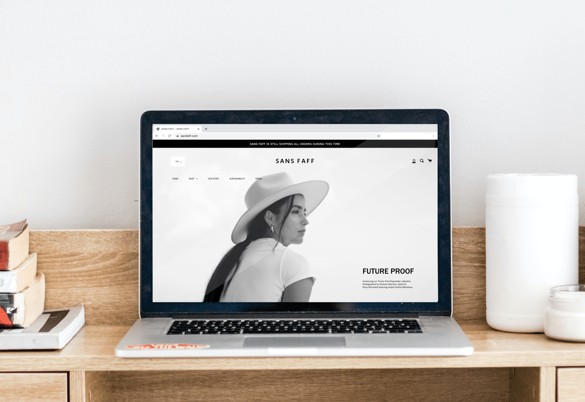
Sans Faff is a minimalist womenswear label focused on producing limited pieces at limited quantities - to preserve resources and avoid waste. The brand has a unique brand personality that is showcased through its online store experience.
We hope these best practices set up on Sans Faff’s online store allows Shopify merchants, especially fashion brands, to optimize their store design.
Storefront Design Best Practices
1. Mesmerize visitors with a brand video
A brand video is sure to turn heads. We set up Sans Faff’s brand video to convey the vibe that the brand has, successfully delivering their brand personality to store visitors as soon as they land on their store.
Brand videos are a great way to learn about a brand. In fact, 68% of consumers prefer to learn about a new product or service by watching a short video.
A video within the header is the best way to engage store visitors better.

Also read: eCommerce Fashion Marketing - Strategies to Sell for Shopify Fashion Stores
2. Showcase products
One of the sections on Sans Faff’s storefront is a gallery of product images. This quick look at different products helps shoppers to view the different kinds of products that the Shopify store sells without having to look at the entire catalog.
The images are photographed within the same color story and have similar composition, maintaining a consistent look and feel on the Shopify store.

Also read: Must-Have Features and Shopify Apps for Shopify Fashion and Apparel Stores
3. Feature a collection
Let your shoppers know about new collections with a banner featuring it and highlighting why the collection is special.
For Sans Faff, this section was kept minimal with a compelling copy to explain more about the collection and why their shoppers must browse the products.

4. Build credibility
Show what makes your brand trustable with logos of publications you’ve been featured on. Sans Faff includes publications like Harper Bazaar and Nylon so that their store visitors can form a strong and positive impression about the brand. Such signs of credibility also make shoppers want to interact with the brand more.
Also read: Complete Guide to Setting Up Your Shopify Fashion and Apparel Store

5. Display sustainability efforts
Sans Faff has a ‘Sustainability’ page that informs their shoppers about the different ways they ensure that their products are ethically manufactured. The page shows shoppers their values, allowing the brand to maintain transparency and attract shoppers who align with these values.

6. Simplify navigation with the detailed footer
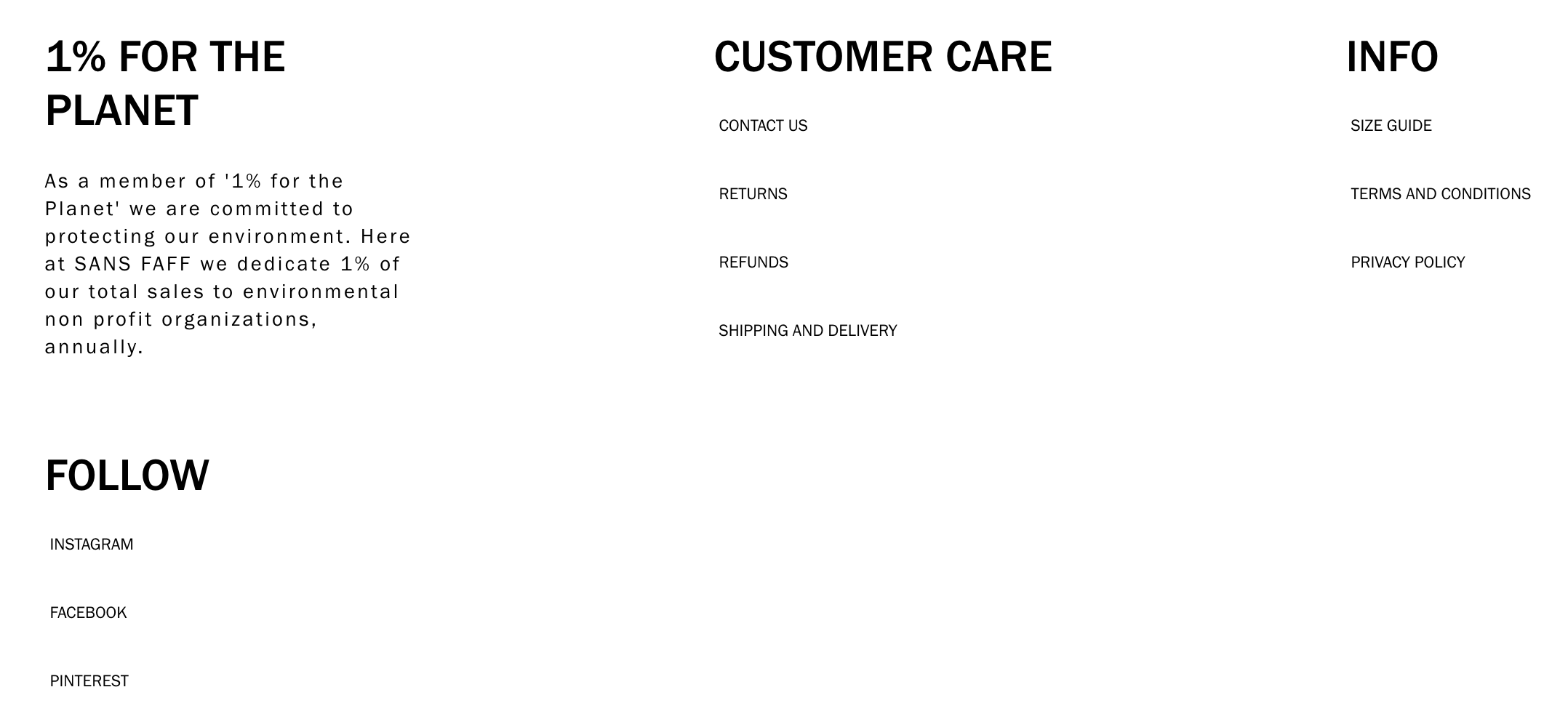
Sans Faff’s footer allows shoppers to go to different parts of the store, based on their different needs. Take, for instance, store visitors who has landed on the store for the first time. Many visitors would scroll to the end of the storefront to see every information about the product, ending up at the footer. They can then click on the page they want to go to from this well-structured footer. Some may want to look at the shipping information, others may want to read about the brand’s sizing, etc.
Also read: Top Shopify Fashion Brands With High-Converting Store Designs To Inspire Yours
With an easy-to-use footer, store visitors don’t have to scroll back up. Instead, they just have to click on the page of their choice.

Product Page Design
1. Keep all content above the fold
Shoppers shouldn’t have to keep moving around the store to find what they are looking for. To ensure quicker navigation, content within all the product pages on Sans Faff’s store is kept above the fold.
If shoppers want to see more images of the product, they can scroll down. However, a first look of the product, details, and the ‘Add to Cart’ button is kept above the fold.

2. Show information about the products in tabs
Shoppers find it annoying to keep scrolling a page to find more information about the product. This is especially true for fashion sites whose products have a lot of information to provide— from sizing to fit to fabric.
On the Sans Faff online store, we showed their product details within tabs that shoppers can switch between. These tabs keep information neatly under each section so that shoppers only have to navigate to the details they want to know more about.

3. Quick access to sizing
One of the best features on the Sans Faff website is the ability for shoppers to quickly learn their size.
Each product page has a ‘What’s my size’ button that allows shoppers to calculate their size based on their height, weight, and body measurements.
Shoppers won’t have to worry about getting the wrong size with such a handy size calculator.

Set up a Shopify store design that increases shopper engagement!
Each store requires specific design customizations, based on their unique needs. At XgenTech, our team prides itself on ensuring that we fulfill the different ideas and plans that merchants like you have.
Also read: Shopify Store Design Breakdown: Hirshleifers Builds Its Presence Online as a Luxury Fashion Brand
Our team of design experts is specialized in setting up eCommerce stores, helping merchants across the globe to bring their store requirements to life.
Need help? Reach out to us on info@xgentech.net.


