
A poorly designed website is an eCommerce store owner’s nightmare.
Your main priority when building and designing your online storefront should be the User Experience (UX). If everything just looks pretty and adds no real value to how smooth a consumer’s shopping journey was, all your efforts go wasted. In such cases, chances are that customers will not complete their purchase and even if they do, they may not come back for another purchase.
This means having a great-looking website isn’t helpful if it is difficult and frustrating to use. That’s why we’re here to share another Shopify store design breakdown to show you how UI and UX can both work hand in hand.
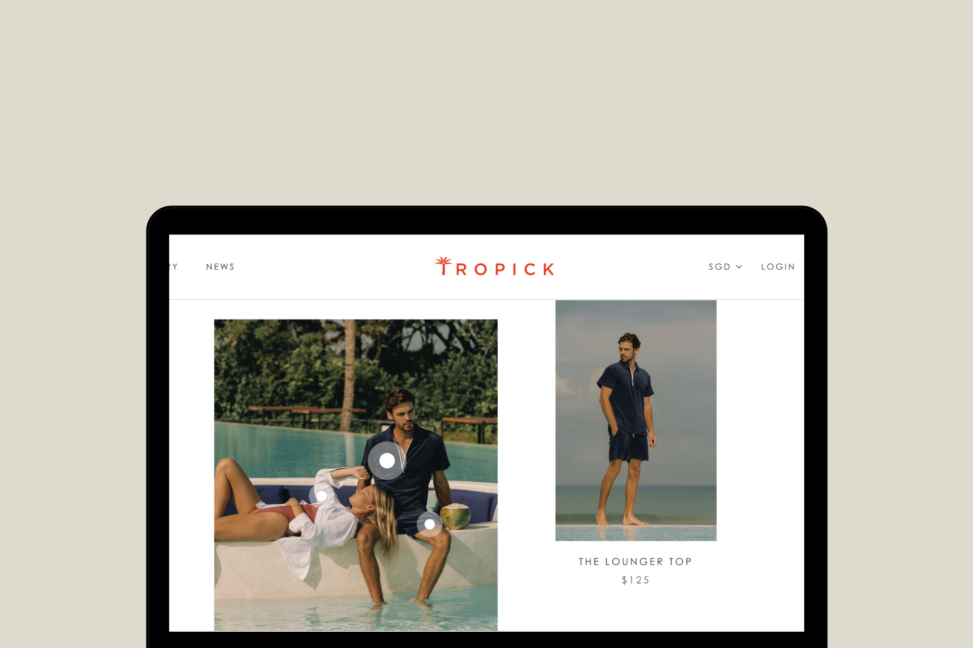
And this time, it’s a Shopify store we had the opportunity to work on - Tropick Apparel.
About Tropick Apparel
Founded by Monica Millington, Tropick makes clothes for “real life”. They believe in clothes that free you from the restrictions of the daily grind, to allow you to perform to your highest– in style.
“We began with a performance dress shirt that changed the game for dressing in the tropics. Our shirts allow you to sweat comfortably (because we know it's going to happen), stretch with your movement, and breathe like your favorite sportswear. The modern fit provides polished silhouettes that can take you from casual to crisp in a flash. We’re listening, looking, and asking questions so we can find big opportunities and little moments to make your life easier.”
The Tropick Shopify store has a lot of interesting UI/UX integrations that help them improve their conversion and retention rates. But at the same time, it also reflects their easy-breezy look and feel of their collection, keeping their branding intact page on page.
Shopify Store Design Breakdown: Tropick Apparel
1. Sticky notification bar
A sticky notification bar means the notification bar is always visible; even when the user scrolls down.
It helps grab the attention of the user to the important links from the get-go. This ensures that the user always has easy access to the necessary pages and/or sections. The use of such a notification bar also encourages user engagement.
Tropick Apparel has very seamlessly integrated this element in their Shopify store design. The notification as such is also quite simple with only the necessary items displayed. Thus, it does not overwhelm the user with too many choices either.

2. Clear and Prominent CTA in the hero image
First impressions are always the best impressions. And Tropick takes this pretty seriously in their store design.
A hero image is a large banner on the landing page. This is the very first thing that any visitor will get to see of your online store. Because of its prominent placing, this is a great place to present your value proposition in the most concise and coherent way possible.
Along with using a visually appealing set of pictures, Tropick has also added a distinct CTA in a bright color to direct the user’s attention to the dedicated product category page.

3. Live chat integration
Any addition to your online storefront that enhances your user’s shopping experience is an instant win.
Consumers are bound to have a lot of doubts when shopping from an online store; especially in the apparel industry. The inability to see, touch and feel the product before making a purchase may affect their purchase decision.
To help along this process, a live chat integration is a great solution. It helps answer the customers’ questions before they become hesitant. It also saves time for both your customers and you.
Additionally, it also gives you valuable insights into your customers’ behaviors. You can use this data to improve the overall shopping experience in your store.

4. Sticky benefits bar site-wide
Tropick offers free shipping and discounts on a user’s first purchase. This can be an irresistible offer for most consumers. And so, they have placed this information in a sticky bar on top of all their pages.
It is placed in such a way that the user is easily attracted to it. It helps persuade the consumer to make a particular purchase by offering an incentive.

5. Star products displayed with their value proposition
An impressive landing page is your chance to put your best foot forward and convince a store visitor to make a purchase.
Tropick has included a section highlighting their star products on the landing page. It helps direct the user to the best of what they offer.
The bulleted content helps convey the benefits of the product in the most concise and comprehensive way. Furthermore, the CTA button is bright and attention-grabbing. The smart use of negative spacing (white space) here elevates the aesthetics of the website without compromising the UX.

6. Unisex products uniquely displayed on the landing page
As mentioned in the previous sections, your landing page can determine if a store visitor makes a purchase.
Notice how Tropick displays its unisex products in a very smart way here. By just hovering over the section, the image changes. This not just saves space but also stands out as a unique design element. It gives the store visitor a very clear idea that the product is unisex without even them having to mention it.

7. Usage of video on the homepage
Videos bring brand storytelling to life, keep visitors informed, help answer common shopper questions, and, most importantly, create a positive customer experience, influencing their purchase decisions.
Videos can also be a powerful tool for answering customer questions and concerns once they land on your homepage, nudging them to explore more of your website.
But videos work best when they fit into the grander scheme of things of your Shopify website design, and are optimized.
Tropick has added a video section in their homepage that just seamlessly helps bring it all together.

8. High-quality product images
Product photography holds a lot of value in online shopping. Since buyers cannot physically see it, this is their best bet at analyzing the product. If the products are shown clearly, it will adversely affect your conversion rate.
Tropick has also accounted for both genders in their product photos. This is a very nice addition.

9. Product videos along with photos
Sometimes, product photos are not enough. To give buyers a better look at the products, videos can be extremely useful.
Tropick uses interesting videos in its product pages. Furthermore, these videos match the overall brand aesthetic, thus tying their brand story together.

10. Personalized size guide with a recommendation
Tropick uses an interesting size guide. It’s a customizable window that asks the buyer for their height, weight, and age as inputs. These options are available in the units cm or ft and kg or lb. It then suggests sizes for them.
There is also another dedicated size guide page, in case the user would like to just take a quick look.


11. Social proof on all product pages
Social proof like reviews, ratings, and testimonials have become an absolute necessity for online brands today. It helps establish trust and credibility.
Tropick’s website also has the ability to sort the reviews based on user preference.

12. Clear progress indicators during checkout
Letting the user know where exactly they are in the checkout process enhances the likeability and UX of your Shopify store. Consumers like to have control over the checkout process and progress indicators aid in it.

13. Prominent coupon code section on the checkout page
Tropick displays the text field to input any gift card or discount code very distinctly on the checkout page. It is also placed in the very first step of the checkout process. This ensures that the user does not miss it while completing their purchase.


Also read: Shopify Store Design Breakdown: Dissecting the Store Design of Allbirds
Conclusion
The design requirements of every brand are different. You need to customize your Shopify store design as per your buyers and products.
If you would want to explore how to do it, reach out to us. We can help you design an excellent Shopify store as we did for Tropick Apparel.
Our team of Shopify experts works with Shopify merchants like you to design the store that reflects the personality of your brand and caters to the functionalities you require. Whether you want to revamp your existing design or build a new one from scratch, we will help you create a positive shopping experience on your Shopify store design.
Reach out to us at info@xgentech.net and we’ll help you set up your Shopify store design!
We're working with some leading Shopify and Shopify Plus brands to help them design a great online experience for their customers. Check out some of our work here.